Welcome to the Alma
Brand Platform!
Designed to give you access to the essential elements of our visual identity.
Please note the following guidelines for responsible use of our resources:
1. We ask that you use the Alma logo appropriately,
preserving the integrity of our brand.
2. Before using the logo, please contact us by e-mail via
our contact page to obtain our prior approval.
3. Upon receipt of a specific request from Alma,
please remove the logo from your communications.
Thank you!
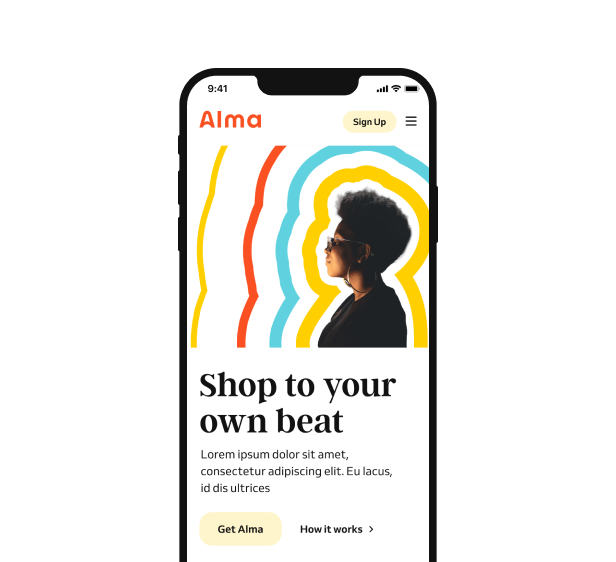
Logo
This is the Alma wordmark, the beating heart of our new branding.
With its simple lettering, rounded shapes and hidden arrow, it’s approachable, trustworthy and progressive just like the business it represents.
Logo
Clear space and
minimum sizing
Carefully crafted by a typographer, the Alma wordmark is ready to go; you just need to keep a few rules in mind. Don’t crop, twist or stretch it. Let it breathe by leaving a space the size of the lowercase ‘a’ around it and beneath it. And to ensure legibility, never use it below 4.5mm in height.
Logo
Logotypes and colors
The Orange Alma Logotype (preferred option)
This logo is our main emblem. Use it consistently in the current form and color on all channels and whenever possible, especially if Alma is not the main focus of the subject.
The Black and White version
Use this version when the use of the Orange Alma logotype does not allow for clear legibility and a good understanding of the layout.
Logo
Our shorthand
wordmark
A is for Alma. This shorthand version of our wordmark was created for use as our app icon and across our social media profiles to ensure maximum impact.
The icon should have a clear space around it equal to the width of two ‘Ls’ from the full wordmark. Draw a perfect square or circle with the icon aligned centrally and you’ll have the minimum height required

Logo
Misuse
We know, we know, you would never do this. But just in case:
Don’t rotate the wordmark.
Don’t alter the kerning or tracking of the wordmark.
Don’t stretch or distort the wordmark.
Don’t add taglines or other elements to the wordmark.
Don’t outline the wordmark.
Don’t add visual effects to the wordmark.
Don’t use the wordmark in any colour other than orange, white or black.
Don’t stretch or distort the wordmark.
Colour
Vibrant, accessible and simple, our five core colours help us stand out from the crowd.
Colour
Primary palette usage
As you have already seen, orange, white and black take the lead in our brand palette. Blue and yellow still have an important role to play though, bringing a dash of energy and optimism into the mix.

Colour
Secondary palette
Our secondary palette of softer tones has been specifically created for our user interface, providing clarity and moments of calm.
Colour
Secondary palette
usage
Our secondary palette is designed for use across our website. Our core black and white have a high contrast, which can cause some discomfort when reading. That’s why we’ve introduced ‘Soft Black’ and ‘Off White’ to improve legibility and comfort for our readers.
Colour
Typography use


Colour
Misuse

Don’t use the white colour type on the orange background.

Don't alter the opacity of our core colours

Don’t use colourways that aren’t part of our brand.

Don’t use our logo in any colours apart from white, black and orange.
Don’t use the secondary colour palette for primary call to actions.

Don't use our secondary colours (blue or yellow) as lead colours.
Don’t use colours that don’t pass accessibility standards.

Don’t use the secondary colour palette for primary beatline colours.

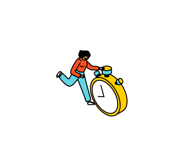
Illustration
A legible and distinctive graphic universe
The graphic treatment of the illustrations was designed to integrate coherently with Alma’s identity, without competing with it. The illustrations are intended to be legible on both a small and large scale.

The threaded line
The line in the illustration is wiry, smooth and closed. On the basis of a 470x470px square, the line should be 0.6pt, and the change in thickness should be proportional to the enlargement of the illustration.

Level of detail
For ease of reading, all unnecessary detail has been eliminated, and the illustration is minimalist in the features and details of the objects and characters.
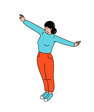
Flat colour processing
For legible and effective reading from the outset, the colour treatment is based on a solid colour without texture or shading.

Respect Alma's logo
To simplify reading and avoid overloading the illustration, the logo should be illustrated without contours, distortions or shadows.
Illustration
Which assets ?
The graphic treatment of the illustrations was designed to integrate coherently with Alma’s identity without competing with it. The illustrations are intended to be legible on both a small and large scale.

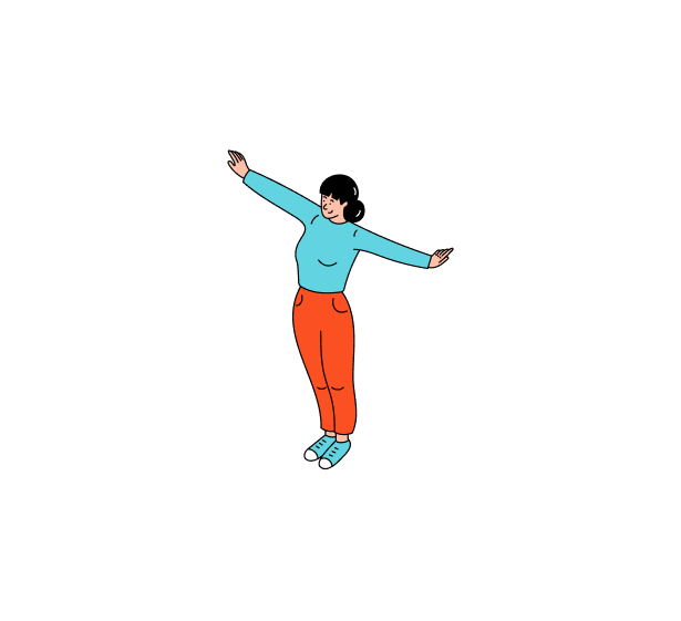
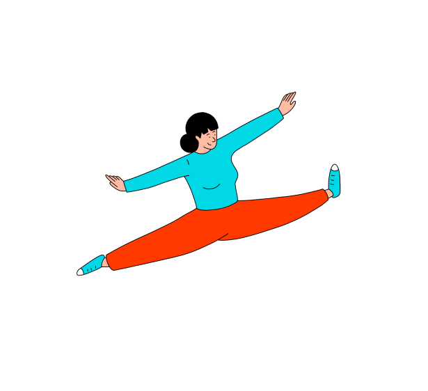
Characters

Objects

Accessories

Icons

Illustration
Misusage

Don’t use open lines.
Don’t use a contour that is not in proportion to the basic contour.
Don't add details.

Don’t draw logo with contours, another colour, distortions or shadows.

Don’t change the character’s style.

Don't make facial features too complex.

Don't make the characters too expressive.

Don't change hair shape, volume or colour.

Don't over gender clothes.
Don't exaggerate character poses.

Don't change the outline color.

Don't overload illustration, pictograms or logos with outlines, distortion or shadows.
Typography
We ve got two distinct typefaces, chosen to help you bring the personality behind our words to life.
Argent CF
For headlines and display
Argent CF text can be left or centre aligned, whichever is more appropriate for the canvas it’s appearing on.

Venn
For body copy and details
We always use sentence case . Never capitalise all words in headlines or bodies of text.

Banners and badges
Inform your customers that they can pay on their items in instalments with Alma. Banners and badges are generally placed next to your products.

Banners
How to use them
We recommend putting the banners at the top of your shop’s main page or product page section, or in the sidebar.


Badges
How to use them
We recommend placing it next to your products so your clients can see it.
Colours
All banners and badges are available in three colour versions : orange, black, grey and white. Prioritise the orange version whenever you can. You can find more details and download the assets below.
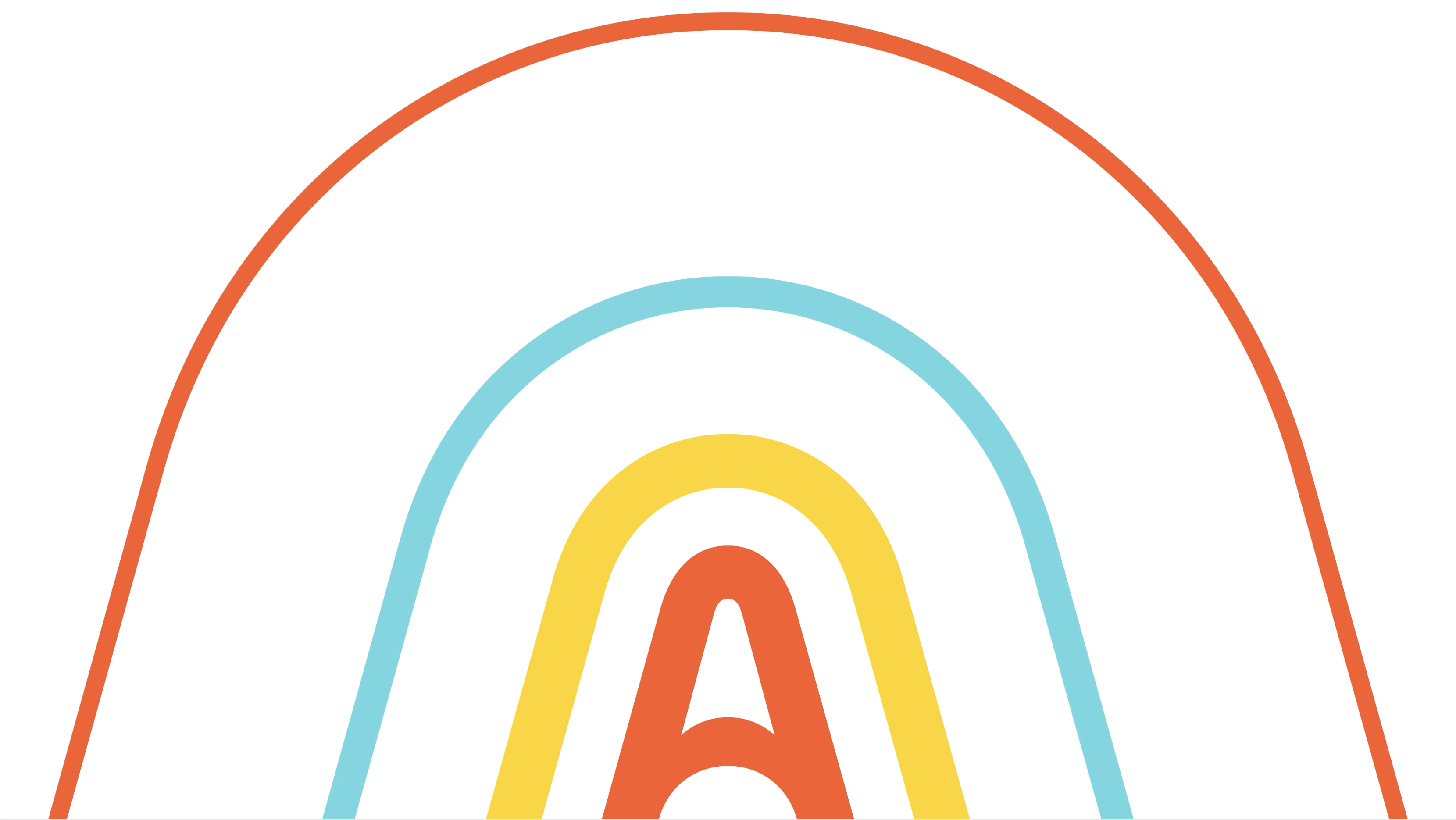
The Beat
A distinctive, dynamic emblem of our core brand idea, The Beat is an absolutely fundamental part of our brand and is present in everything we do.
The Beat
How to use it
Illustrated as a set of radiating lines, decreasing in size as they spread outward: The Beat is a simple idea, but it can be used in many ways across our brand.
To the right, you’ll see the static version is the primary version of The Beat, but we’ll detail a number of alternative uses below. Need guidance on how to use it in motion? Head to our separate motion guide.

The Beat
Cropping The Beat

There are many different ways to crop The Beat, just make sure not to crop into the 'A' at the heart.

There are many different ways to crop The Beat, just make sure not to crop into the 'A' at the heart.
There are many different ways to crop The Beat, just make sure not to crop into the 'A' at the heart.

There are many different ways to crop The Beat, just make sure not to crop into the 'A' at the heart.

There are many different ways to crop The Beat, just make sure not to crop into the 'A' at the heart.
The Beat
The Beat colourways
The Beat has two different colourways: the primary version on a white background or the secondary solid white version on an orange background. The orange background colourway is for merchant use only and the primary white is for everything else.
The Beat
Misuse
The Beat is perhaps the most expressive part of our new brand, but don’t let it get too expressive.

Don’t alter the widths of The Beat lines or the spaces between them.

Don't alter the sequence of the colours. It should always be orange, yellow and blue repeating outwards.

Don't use colourways that aren't part of our brand.

Don't alter the shape of The Beat lines.

Don't outline The Beat lines.

Don't crop The Beat through the 'A'.

Don't use The Beat lines to create new graphic devices or icons.

Don't use The Beat lines to crop photography. Guidance on that is up next.
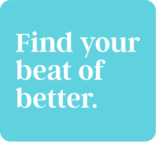
Tone of voice
Here are four simple principles inspired by our brand personality to help you make Alma’s voice heard.
Principles
Progress Find The Beat
We’re always moving forward. Always writing in forward motion, but it’s not about punch. It’s about pace. Getting to the point and onto the next one with a calm, collected confidence that leaves the reader fully engaged and energised.
Empowerment Put people at the
heart
We’re here to help people. So, show them they’re top of mind. Speak directly (lots of ’you / your’). Make it easy for them to act, with compelling calls to action. And in our content, make people a feature, highlighting their stories, products, and passions personalising wherever possible so they can clearly imagine what Alma can do for them.
Clarity Simplicity is the
ultimate sophistication
Life is complicated. Alma isn’t. We never use a long word when a short one will do. We’re precise. We put the most important info first and dive into detail later. And if we absolutely have to talk about something complex, dull or technical, we break it down so everyone’s on the same page.
Integrity Honesty is the best
policy
Our industry has… a bit of a reputation problem. We want to show people there’s a better way. So, every message (from the longest letter, to the quickest tweet) should build trust. Keep people informed. Elevate the facts. And be refreshingly, unfailingly honest.
Tone of Voice
Our audiences
We stay true to ourselves and our writing, no matter our audience. It’s the same Alma, just in a different room and we adapt our language to the context by discussing different topics and meeting different needs.
